Proper Notices can make a real impact to ratepayer appreciation of the Garden, and improve ratepayer-committee relations. In this post we share our top tips for creating good notices for your garden.
Tip 1: Find a Printer of "Outdoor" / "Weatherproof" posters
Not all printed media is created equal. Normal paper in an outdoor notice board will quickly dishevel and degrade. Laminated paper adds an additional layer of gloss behind the glass, making it harder to read.
The solution? Many online printing companies offer printing using ink and paper designed to stand up to the elements, ensuring your notices look good as new for the length of their service in the Garden.
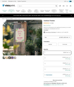
Our recommendation is Vistaprint’s Outdoor Poster Range, or for more exposed locations, their Waterproof Poster Range.
Tip 2: Prepare Your Template
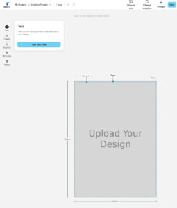
Once you have found your preferred printer, find out the dimension you need for your template, and pick a suitable design tool.
We’d recommend Google Sheets (Free) or Microsoft Powerpoint (Paid) as flexible, easy to learn tools for this type of work.
Below are some Vistaprint templates for either tool:
Be sure to consider two factors before sending designs to print:
- Your notice board may be built in such a way that it covers part of your poster when closed; the contents should be planned accordingly
- The printer will advise (online / in person) if a safety margin should be kept around the document (with all content inside that margin)
Tip 3: Keep the Font Size Big

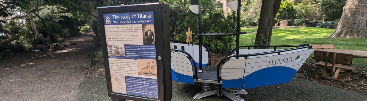
We’ve all seen noticeboards filled with pages of letter sized text and felt the instant disincentivisation to engage with the content.
Even when you can stand right besides a noticeboard, we recommend a minimum font-size of 18 to make the content user friendly.
If, as with the notice board pictures, you need to stand away from the content, a minimum font size larger than 18 is advisable. If in doubt print out a test page of different font sizes and see what is comfortable to read.
Tip 4: Use Consistent Branding (Fonts and Colours)
It’s not only the quantity of text that can be jarring in a notice, but also the variety of fonts deployed.
We encourage our clients to set a consistent approach to fonts across all media (website, letters, notice boards). Having a specific font for Titles/Subtitles, and another for regular text can help distinguish sections.
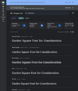
A Serif Font can be a good choice for Titles / Subtitles, giving a more classic / vintage feel. For normal blocks of text, a Sans Serif Front is typically easier to read.
Picking fonts from Google Fonts is a logical choice, as they can be used in Google Docs / Slides (free for all), or downloaded for use in Microsoft Office.
Tip 5: Dont Skimp on *Complimentary* Colours

As a professional printing service will likely charge you the same for a colour, or black-and-white weatherproof poster – you might as well add some colour to your notices.
Finding complementary Colours is straightforward using free tools like Adobe Color that use the long established principle of colour wheels to find colours that work well with each other.
In Adobe Color, set the base colour (such as the colour of your logo) in the middle of the 5 colour scale on the homepage, then toggle the Color Harmony dropdown in the top left corner of the page.
You will need a rudimentary understanding of colour modes, which youtube can help with.
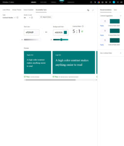
Tip 6: Check Accessibility of Colours
One checkpoint when using colours is to check the accessibility of your choices.
Minimum Contrast Requirements:
A font in a lighter colour may be hard to read on against a white background.
Similarly font in a dark-to-medium colour would be hard to read against a black or other dark background.
Fortunately Adobe Color has a Contrast Checker to check the readability of a given font colour against a given background colour.
Color Blind Considerations
Adobe Color also has a Color Blind simulator to check for how colours would appear to viewers that struggle to view red, green or blue light.
Tip 7: Consider Adding Iconography
Notices can be made all the more interesting and accessible (especially to non-english speakers) by adding icons that correspond to the accompanying text.
There are several great reasources for Icons that can be used without attribution, though arguably the best starting point is SVG Repo that has a large variety of mostly attribution-free icons (subtip: check the lisence on each icon’s page).
Iconmonstr is an alternative site with almost 5,000 attribution-free icons.
Tip 8: Check Your Alignment
The final step in professional looking notices is consistent alignment and spacing.
Most tools like PowerPoint or Google Slides have automated features for aligning objects. There are also helpful Youtube Videos, like the following clip (for Google Sheets), that succinctly explain how to use these tools effectively.
Previous Story
Latest Access Control Technology
Next Story